Monday, June 29, 2020

Feel Like It’s Working Out OK?


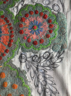
I’ve been working on this a lot lately. You know how you need to do a fair bit of something before you decide if it looks ok or not? Well, those side flowers... around the orange dots... I struggled for a good idea to fill the space, because something needed to happen. I feel like it’s worked, in as much as I didn’t want another ‘thing’ happening, but the plain greys looked boring and vast. This gives a subtle, soft and pretty vibe to the sides. So, I’m happy. 😊 Not sure what colour the centers of these little blossoms will be. Red might be a bit much? Or just right. Fortunately it’s not much hooking to try a few different colours.
That’s a question by the way. Is red too much? There’s only one with a centre, see? Waddya say?
Or maybe the pink ones could have blue centers and vice verse. Hmmm...

The blue of the new side blooms kind of vanishes, but its ‘glow‘ is the effect that feels right. It’s there and not there.
I’m busting to start my next design. I’ve been drawing and redrawing for the last week or more. Weeks. At work, keeping away from everyone else in a little room. Waiting to do the actual work I’m paid for is way more fun. If we’re quiet, then I’m taking the opportunity and running with it.
I bought a scrap book, and have been pasting printouts of the moods I want and any references etc. It feels as fun as primary school. Old school cut and paste.
Another thing, I want to make chaise coasters to stop the legs marking the carpet after it’s finished.


Monday, June 15, 2020

Decisions On The Chaise Rug


I’ve been steadily plodding away at this rug and now have to decide about a couple of things.
Firstly, the blue in the centre of the larger floral motifs is from an old cardigan (meaning it’s not dyed wool and has a different cast) and the colour seems too strong. I might change that and use the same as the other flowers. Yes...
Secondly, maybe the pink and probably the oranges in the larger motif doesn’t feel right. Either or. I’m not sure whether to bring the pumpkin into them? Mmm... Or is it just the lighter, candy orange one (nearest in pic above)?
Sitting here on the verandah on this gorgeous, mild winters’ day, I see there’s a clash that offends me. I’m just pondering out loud and inviting you to suffer along with me.
I don’t care what anyone says, I like the green.
You can see I’ve made a dogs-breakfast with my scribbling in figuring out the background. I tried adding a swathe sort of thing in subtle but different colours, which looked wrong... then I added raised spots with the background colour. They looked amazing but not for here. It was way too much and it’s already too colourful for the poor One True. Good idea for another rug... just raised spots in one colour. Like those moss rugs.
So I’m stumbling through the fog of an idea to use only background shades to suggest foliage, inter dispersed with dots that are not raised (I’ve started but the floor really really really needs vacuuming and my hand hurts).
Or, just work in a direction, with lines flowing out as the now defunct swathes suggested.
Excuse me for boring you to tears, and please, feel free to butt in. 
But you might be pleased to know I’ve decided stuff just in talking it through. Thanks.