Showing posts with label Rag Rugs. Show all posts

Wednesday, July 29, 2020

That’s It!

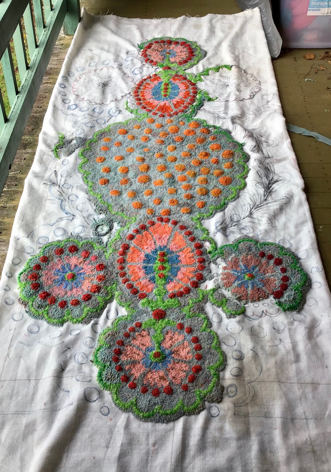
I’m amazed at how much difference the binding makes. So I’m finished. 24th  May 2015 until 29th July 2020. You won’t have to look at my incessant progress reports anymore!
220cm long x 112 cm wide.
Is binding the absolute worst part or what!
I’ve placed it forward f my last try out. Looks better but I think it will be for  my bedroom or front hallway, when we get one?
Thanks to my rug hooking friends comments too. Much appreciated!


Friday, July 24, 2020


I’m not going to think about it anymore. Just need to bind it up and bung it under the chaise. Not thinking... 
Like... yes, I know the colours don’t directly relate to the chaise, it’s a separate stand alone. Goes with the cushions. And I’m already imagining a swirling mass of Pompeii style gold octopus or frolicking deer and flowers picked out from the upholstery... hmm, sounding good... That would compliment the beautiful piece of furniture better. Sigh.
And if the background was a green grey, rather than duck egg... Or golds with a subtle sky at the top/back...
And let’s face it, a rug at least a metre longer and wider... which wouldn’t fit in the house by the way.


Monday, July 13, 2020

I Thought I’d Be Finished This Weekend! But...

Apart from the binding, I really thought I was nearly there... and I am, in the scheme of things. But laying it out shows I have a way to go.
So, to decide:
Do I like the oval shape? I guess I won’t know for sure until it’s in situ. Bit meh at the minute. Too... clean lined or something. Pukey?
Still not completely sold on the apricot either but same, situ will tell. I will change it if I don’t. None of this ‘Oh Well‘ business when you’re looking at it for evermore.
It’s a bigger! I could lay down and stretch my arms up in the air and still be on it just about. And I’m 5’7”.
I feel like the flowers along the sides work (like the green) to make a textured fabric (visually) rather than dominate. Hubby pointed out that I tend to use similar values together in patterns. I’m not sure if he thought it a good thing (as in, you hardly notice it). I hadn’t pondered it before but, wanting a large, neutral background, it can be a bit boring if you do it all the same, even if it’s mottled.
My friend Chris made a large rug, shown (badly) below, and you can see her excellent background. It’s subtle but very effective.


Anyhow, here I am. I think if I decide to make it a rectangle, I’ll do the corners in the same orange dots of the centre. Hmm, that sounds like a bit of a plan? 

Monday, June 29, 2020

Feel Like It’s Working Out OK?


I’ve been working on this a lot lately. You know how you need to do a fair bit of something before you decide if it looks ok or not? Well, those side flowers... around the orange dots... I struggled for a good idea to fill the space, because something needed to happen. I feel like it’s worked, in as much as I didn’t want another ‘thing’ happening, but the plain greys looked boring and vast. This gives a subtle, soft and pretty vibe to the sides. So, I’m happy. 😊 Not sure what colour the centers of these little blossoms will be. Red might be a bit much? Or just right. Fortunately it’s not much hooking to try a few different colours.
That’s a question by the way. Is red too much? There’s only one with a centre, see? Waddya say?
Or maybe the pink ones could have blue centers and vice verse. Hmmm...

The blue of the new side blooms kind of vanishes, but its ‘glow‘ is the effect that feels right. It’s there and not there.
I’m busting to start my next design. I’ve been drawing and redrawing for the last week or more. Weeks. At work, keeping away from everyone else in a little room. Waiting to do the actual work I’m paid for is way more fun. If we’re quiet, then I’m taking the opportunity and running with it.
I bought a scrap book, and have been pasting printouts of the moods I want and any references etc. It feels as fun as primary school. Old school cut and paste.
Another thing, I want to make chaise coasters to stop the legs marking the carpet after it’s finished.


Monday, June 15, 2020

Decisions On The Chaise Rug


I’ve been steadily plodding away at this rug and now have to decide about a couple of things.
Firstly, the blue in the centre of the larger floral motifs is from an old cardigan (meaning it’s not dyed wool and has a different cast) and the colour seems too strong. I might change that and use the same as the other flowers. Yes...
Secondly, maybe the pink and probably the oranges in the larger motif doesn’t feel right. Either or. I’m not sure whether to bring the pumpkin into them? Mmm... Or is it just the lighter, candy orange one (nearest in pic above)?
Sitting here on the verandah on this gorgeous, mild winters’ day, I see there’s a clash that offends me. I’m just pondering out loud and inviting you to suffer along with me.
I don’t care what anyone says, I like the green.
You can see I’ve made a dogs-breakfast with my scribbling in figuring out the background. I tried adding a swathe sort of thing in subtle but different colours, which looked wrong... then I added raised spots with the background colour. They looked amazing but not for here. It was way too much and it’s already too colourful for the poor One True. Good idea for another rug... just raised spots in one colour. Like those moss rugs.
So I’m stumbling through the fog of an idea to use only background shades to suggest foliage, inter dispersed with dots that are not raised (I’ve started but the floor really really really needs vacuuming and my hand hurts).
Or, just work in a direction, with lines flowing out as the now defunct swathes suggested.
Excuse me for boring you to tears, and please, feel free to butt in. 
But you might be pleased to know I’ve decided stuff just in talking it through. Thanks.

Saturday, May 30, 2020

Hall Rug Inspirations

I figured out the middle, fish. I had drawn a dove but it looked weird upside down so left it blank.
Hubby is a keen fisherman. KEEN. And looking at ancient mosaic floor images I caught the vibe!
Inspired also by Heronimous Bosh and his weirdly scaled creatures...
I’m busting to start and determined not to yet.

I need to slightly tweak the fish so they read from both ends and have no  right side up.
Follow the tag ‘Hall Rug’ for a progression.


Friday, May 22, 2020

Right, The Chaise Rug Saga... What Next?


Jo Franco asked me to show how much I'd done and it's at a good point to regroup anyway. 

Right, well, firstly... This rug is to go underneath an old chaise, hence the 3D effect on the dots. The legs go in the middle of the space in each corner, so the 3 outside 'flowers' surround them.

I can see I need to actually lay it out under the chaise, sigh. Boring! (Update. I did and I'm very happy with everything as it is. Phew!).
Question to myself (and to you): I'm not sure about the green anymore. There's a clear green in the ancient Bulgarian rug which will be in the same room, but the green blanket I've used is very clean and crisp. It might need to be removed. While I'm at it, I'm not sure about the apricot either! But I'll wait on that one. And the larger flowers' centres.
Answer: The green glows and picks up on the shine of the French hand-loomed silk upholstering. There's a story behind this chaise too...


This is the first rug I did, which inspired the newby. I love these dirty greys, but made the new one  more duck egg blue. Nice. Very happy about that. But I'm noticing how earthy that one is and I like that. This one is getting too candified. Buggrit! Bit depressed but I'll push on through!The dirty pink works nicely so maybe I need to replicate that mood. I already said buggrit!
These dotted lines are more subtle.


You can't see well with these photo's, but all is well, it looks good. I made coffee so I could sit and problem-solve, putting my big person pants on in case I really needed to pull a lot out and do it again. But no.. I'll just plug on.

I think the ends can be oval. The chaise may end up anywhere after the renovations and the rug neds to be a frame for it plus fit against a wall or in the open. Plus, I might replicate the leafy swathes as on the frst Uzbekistan inspired rig and as drawn on the fabric. Not sure what colour yet.
Thanks Jo! If you hadn't asked, I wouldn't have gone through this experimant and may have sunk into depression!


Monday, April 13, 2020

Plans For A Hall Rug

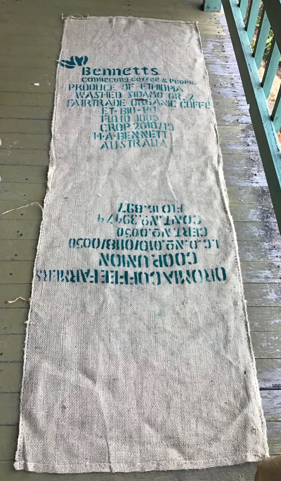
I was given a couple of hessian coffee bags and the size lends itself to being a hall rug. We’ll have a hallway when we renovate. It’s a bit over 2 metres long.
I’ve collected designs on Pinterest for some time and made a Short List folder and the feeling became clear. The pictures are largely German folk paintings but remind me of Heronemous Bosch, a favourite. Maybe it’ll change more, who knows? It’s not hard to over draw.
This time, unlike the footy rug, I’ll use colours that fit with how we intend to decorate. Old colours I suppose, though these things change. The figures look a bit cheesy here, but I can imagine them subtlety done and not dominant. No hurry though, I have the other rug to finish. Oh, two other rugs.
Look here.https://www.pinterest.com.au/robynemelia/rug-hooking-inspiration-for-rugs/hall-rug-short-list/
I want to use old clothes and my fabric stash, not wool.


Sunday, February 23, 2020

Some Thoughts On Proddy Rugs

Within the group, we have made a few Proddy or Proggy or Clippy or Peggy rugs. I’ve made two myself, with another on the frame. 
Whilst you can’t get the finesse or detail of hooked rugs, the ‘impressionist’ look you will achieve is lovely, let alone the beautiful softness. But I have some opinions on the matter, and for my own future reference and to share I'll stick them together and have a blether (something for the new Facebook page). 
Back


Anne Shafer's Liquorice Allsorts proddy rug. The colurs are well defined against each other. Each line is at least three rows of prods. Anne mostly used blankets and polo fleece.
Next is Anne's Poppy rug. Again, even with the mottled background, the poppies pop. 


Inspired to try my hand and use up a substantial amount of stash, I worked out a design and began my own. The silky nature of the fabric gives it a lovely sheen. Used are old shantung curtains, cottons, silks... mostly dress fabrics.
I cut the strips slightly off grain, not a full bias. This means the ends don’t fray. Something I ignored on the next yellow and pink version and it sheds bits all over the place. Which doesn’t bother me really. Not as much as it should.


I followed Anne's advice, making my sections each a good contrast and the lines three rows thick. The green lines separating the sectons and a dark brown behind it works quite well. I'm really happy with this one! So...

I started another... It looks brighter here I have to say. I’ll often start with a couple of fabrics (from my stash) that I want to design around. In this case it was the yellow and some pinks and lilacs (as per the centre of the first). I thought I’d cut my bits longer than the last but this was a mistake, I feel. It’s too shaggy! Mind you it feels lovely underfoot... Plus, the value or shade of the lilac is too similar to the yellow, so it’s not well defined. One of the pinks is a muted dusty colour (pretty in itself), but it looks a little muddy. While the back shows reasonable definition, the front doesn't. Still... it'll do...

To be honest, I started this one (below) second, but it's been rolled up for Quite Some Time. I do love using silks and exotic fabrics, old clothes etc., so get sidetracked, and whilst I like the colours, they're not really going to suit the house. I do that all of the time though, so what's new? It's all blanketing.
I thought that would make it tough and hard to step on, but it isn't. It's cosy.


OK so just get on and finish it! But, my point is (in writing this) the colour definition is nice. Note to self, take your own advice!
Chris Noorbergen is making this gorgeous tropical leafy rug. 'll get a better picture. Chris lives at lovely Loch, in West Gippsland (I'd say it's Gippy). Her strength of colour is beautiful and the dyed blackish background makes the design very strong.


Obviously there is a lot to be said for any type of design and we only have to follow our own taste. My hubby is always telling me to do a scketch first but the only one I have done is for the only one I'm not in love with. It's hard to know what fabric I'll find. If you are dyeing your cloth, then  you can colour in your drawing. But when it's all scraps and stash it's a bit more difficult.
I want to start another proggy now though. Now I know what I need to think of. Maybe I'll think through Where I want it, What is needs to go with and begin from there.
Or maybe I won't.


Monday, January 27, 2020

Night Footy at the G


80 x 80cm.
Finished for real this time. I redid the sky and it looks more muted in reality. 
Made using Dad’s, Mum’s, Grandma’s, my own and op shop clothes with other bits and pieces from my stash.
It did occur to me that if I made the Geelong jumper into a St. Kilda one, the family history would come fully into play. Grandma, Mum and I were Essendon and the boys were St. Kilda.


Geelong is out front but Essendon has the ball!


Dad’s jeans, jocks (not worn more than once or twice) and t-shirts, mine and Mum’s undies too ha ha ha! Only the decent bits of course. And Grandma’s green dress and purple jumpsuit.
I don’t know where to put it really. It doesn’t fit with the house, I just liked the drawing done by Paul Constance at work and wanted to make it.


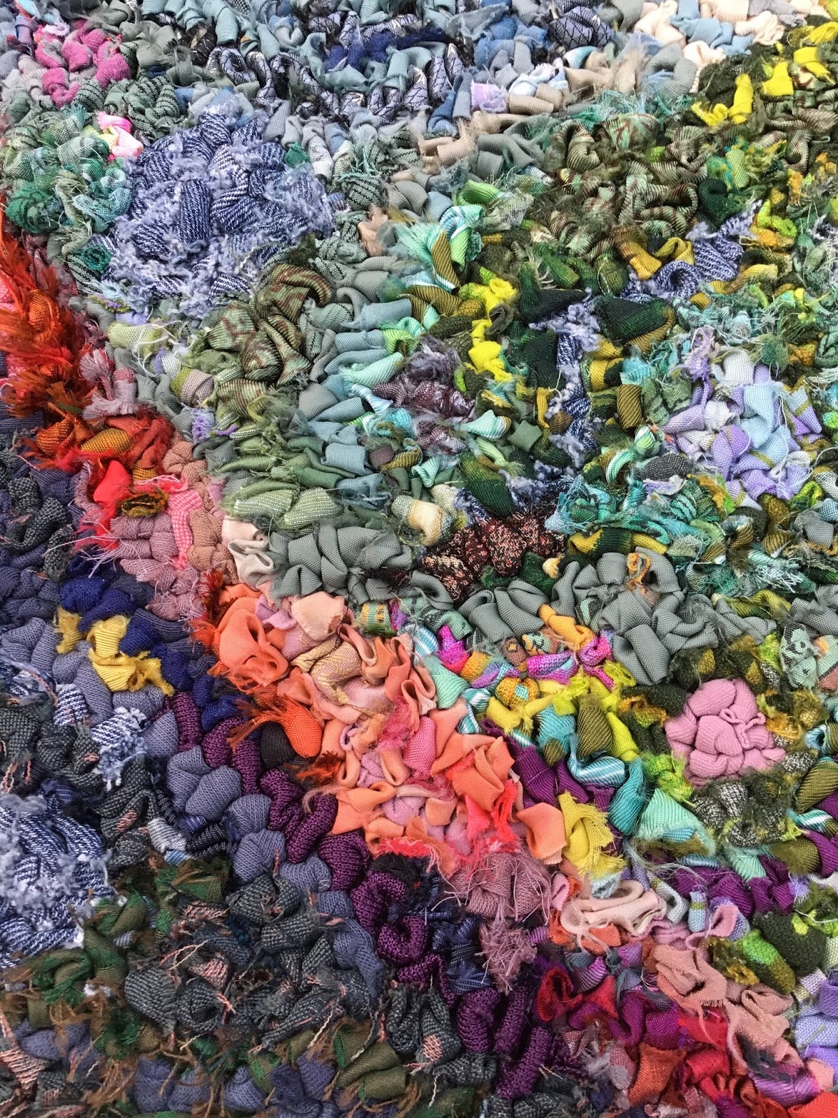
If you look closely at the mix of fabrics used, you can see it’s possible to use anything.


Paul Constance’s little,drawing.